In economic news, the phrase "the yield curve has inverted" almost always arrives in an anxious tone. There's good reason for that. An inversion of the yield spread has been one of the most consistent predictors of U.S. recessions over the past several decades. This article walks through how it works, step by step.
What the yield curve is
The yield curve plots the interest rates of government bonds across different maturities. Normally, the longer the maturity, the higher the rate, since lending money for longer demands more compensation for inflation and uncertainty. This upward-sloping, healthy shape is called a normal yield curve.
The most widely used comparison is the 10-year Treasury yield minus the 2-year Treasury yield, written as 10Y-2Y. In ordinary times this figure runs positive.
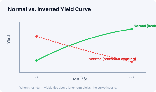
A normal curve slopes up; when short-term yields rise above long-term ones, it inverts and slopes down.
What an inversion means
When the yield spread turns negative, meaning the short-term rate (2-year) rises above the long-term rate (10-year), it's called a yield-curve inversion. Intuitively this seems strange. Why would anyone accept less interest for lending longer?
The answer lies in market expectations. Short-term rates are driven heavily by the central bank's current policy rate, so when the Fed raises rates aggressively to fight inflation, short-term rates rise with it. Long-term rates, on the other hand, reflect distant growth and inflation expectations plus expectations of future rate cuts. When investors expect that rates are high now but the economy will soon slow and the Fed will cut, long-term rates settle relatively low.
An inversion, in other words, is a signal that the market is collectively betting that today's tightening will eventually lead to an economic slowdown.
The historical record
In the U.S., inversions of the 10Y-2Y spread have preceded almost every recession over the past several decades. Most major downturns since the 1970s followed an inversion, which is why this indicator has become an economic traffic light watched by economists and investors alike.
There are important caveats, though. The lag is long: from an inversion to the actual recession typically takes 6 to 24 months. An inversion doesn't mean an immediate market crash, and in many cases stocks kept rising for a while afterward. It's worth watching the un-inversion too, since some analysts treat the moment the curve re-steepens back to positive as an even stronger sign that a recession is near. And it isn't infallible: as the monetary-policy backdrop changes, some question whether its predictive power is as strong as before. There have been slowdowns without an inversion, and stretches where an inversion lasted but the recession got dodged entirely.
How to use it
The yield spread works less as a timing tool than as a compass for the risk environment. If the curve is deeply and persistently inverted, it's reasonable to keep in mind that you may be in the late stage of the cycle, and to use that as a prompt to review asset allocation and risk management. A steepening curve, by contrast, can reflect expectations of economic recovery.
This indicator reads more richly alongside the level of short- and long-term rates, the Fed's policy direction, and credit spreads.
In the macro tab of the Global Market Dashboard, you'll find the U.S. 2-, 10-, and 30-year Treasury yields together with the 10Y-2Y yield spread as a chart. See for yourself where the curve stands right now. For the wider picture, see Getting Started with Global Markets.
How FearGrid's Market Signal reads this
The yield-curve spread is not just a third-party number we display. It is a direct input to the Market Signal index that FearGrid computes itself from public data. That index blends three pillars, and the 10Y-2Y spread, together with the momentum of the Fed's broad dollar index, makes up the rates and liquidity pillar, which carries a 35% weight in the composite.
One detail matters: we convert the spread not into an absolute level but into its position relative to the past three years (the three-year average sits in the middle). That lets you read at a glance how compressed the curve is versus normal, and therefore how unusual an inversion really is. Check the Market Signal at the top of the home page to see where this pillar sits now and which way it is pulling the composite score.
Primary source: Daily Treasury yield curve, U.S. Treasury
This article is for informational purposes only and is not investment advice.