Along with inflation, the macro data that moves markets most is the jobs report. Employment is the foundation of spending and one of the Fed's two mandates, price stability and maximum employment, so a single number can swing rate expectations and asset prices. Here are the three key gauges.
Nonfarm payrolls
Released on the first Friday of each month, this is the number of new U.S. jobs added outside the farm sector. It shows the month's change in jobs across non-agricultural industries and gets called the economy's thermometer.
Roughly 100,000 jobs a month or more is seen as a solid labor market, enough to absorb population growth. A sharp drop, or a swing to negative, signals a slowdown.
Markets react less to the figure itself than to the surprise versus expectations. When jobs come in too strong, stocks can fall on fears that rates will stay high for longer, a case of good news reading as bad news. When they come in too weak, recession worries grow instead.
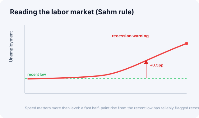
Speed matters more than level: a fast half-point rise from the recent low has reliably flagged recessions.
Unemployment rate
This is the share of the labor force that's looking for work but unemployed. The signal here is the direction and speed more than the absolute level. Historically the unemployment rate drifts down slowly, then spikes sharply in a recession, an asymmetric pattern worth knowing.
This is where the famous Sahm Rule comes in. It's an empirical rule stating that when the 3-month average of the unemployment rate rises 0.5 percentage points or more above its low of the prior 12 months, a recession has likely already begun. It's captured past U.S. recessions fairly consistently.
Initial jobless claims
This is a high-frequency gauge released weekly: the number of people who newly filed for unemployment benefits that week. It catches changes in the labor market faster than monthly data, so it serves as an early warning.
Low and stable readings, roughly 200,000 to 250,000 a week, mean solid employment. A trend rise past around 400,000 gets read as a deteriorating labor market. Because it's weekly data and noisy, it's standard practice to read the trend through the 4-week moving average rather than any single week's print.
Why markets are so sensitive
Employment feeds directly into the Fed's policy function. An overheating labor market raises fears of wage-driven inflation and prolongs tightening, while a fast-cooling one gives the Fed a rationale to pivot toward cuts. So the same weak-jobs reading can be read as good news, meaning cut expectations, or bad news, meaning recession fears, depending on the phase the cycle is in.
How to read it
- Use all three together. Payrolls, the unemployment rate, and claims complement each other's lags and noise across monthly and weekly cadences.
- Watch trend and speed. The direction over months matters more than a single month, and the speed of any rise in unemployment deserves special attention.
- Consider the Fed's gaze. The market's reaction depends on whether the Fed currently weighs inflation or employment more heavily.
Indicators worth watching alongside
Jobs data sharpens the economic picture when grouped with inflation (CPI), the Fed funds rate, and the yield curve.
In the "Economic data" panel of the Global Market Dashboard's macro tab, you'll find the monthly change in nonfarm payrolls, the unemployment rate, and initial jobless claims with reference lines. Check which phase the labor market is in now.
Primary source: Employment Situation, U.S. BLS
This article is for informational purposes only and is not investment advice.