Technical analysis reads price and volume on a chart to gauge where a market might head next. It does not value a company the way fundamentals do; it studies the behavior of price itself. Two tools are enough to start: moving averages and the RSI.
What technical analysis is
The core belief is that price already reflects what participants know, and that patterns in price tend to repeat because human behavior does. It is a tool for framing probabilities, not a crystal ball. Fundamentals ask what a stock is worth, covered in the guide on PER and PBR; technical analysis asks what the crowd is doing right now.
It is worth being clear about what it cannot do. It cannot tell you whether a company is profitable, whether its debt is manageable, or whether the product is any good. A chart that looks perfect belongs to businesses that go on to double and to businesses that go bankrupt. Technicals describe behavior, not value.
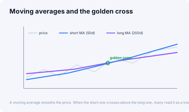
A moving average smooths the price. When the short one crosses above the long one, many read it as a trend turning up.
Moving averages
A moving average plots the average price over a window, say 50 or 200 days, smoothing out the noise so the trend stands out. When a short average crosses above a long one it is called a golden cross and read as bullish; the reverse, a death cross, is read as bearish.
Simple versus exponential. A simple moving average (SMA) weights every day in the window equally. An exponential moving average (EMA) weights recent days more, so it turns faster. Neither is better in the abstract: the EMA catches a real turn sooner but also reacts to noise sooner, while the SMA is calmer but later. Traders who want early warning lean on the EMA; those who want fewer false alarms lean on the SMA.
Choosing the window. Shorter windows track price closely and flip often; longer windows ignore small moves and change direction rarely. The 50-day and 200-day are conventions rather than magic numbers, but they matter partly because so many people watch them, which makes reactions around those lines somewhat self-fulfilling.
💡 Tip: Moving averages often act as dynamic support and resistance. Price dipping to the 200-day line and bouncing is a pattern traders watch closely.
Where they fail. A moving average is an average of the past, so by construction it is late. The golden cross is not a prediction; it is a report that a turn already happened. Worse, in a sideways market the two averages cross back and forth repeatedly, generating a string of signals that each lose a little money. That pattern, called a whipsaw, is how trend tools bleed traders during range-bound stretches. Moving averages earn their keep in trends and punish you in chop.
RSI: momentum and extremes
The Relative Strength Index measures the speed of recent gains against losses on a 0 to 100 scale. Roughly, it compares the average size of up days to the average size of down days over a window, usually 14 periods. If gains dominate, it climbs toward 100; if losses dominate, it falls toward 0. It is a measure of how forcefully price is moving, not of how far it has moved.
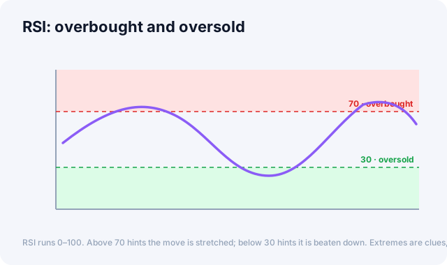
RSI runs 0 to 100. Above 70 hints the move is stretched; below 30 hints it is beaten down. Extremes are clues, not signals.
| RSI reading | Common interpretation |
|---|---|
| Above 70 | Overbought, a pullback is possible |
| 30 to 70 | Neutral range |
| Below 30 | Oversold, a bounce is possible |
Why 70 and 30 mislead beginners. The single most expensive mistake is treating "overbought" as "sell." In a strong uptrend the RSI can sit above 70 for weeks while price keeps climbing, and shorting each time it crosses 70 is a reliable way to lose money. Overbought means the move is forceful, which in a real trend is exactly what you would expect. The 70/30 lines are useful in a range and treacherous in a trend, so the first question is always which of the two you are in.
Divergence. The more interesting RSI signal is not the level but the disagreement. If price makes a higher high while the RSI makes a lower high, buyers are pushing the price up with less force than before. That gap, called bearish divergence, often precedes a stall. The mirror case, price making a lower low while the RSI makes a higher low, is bullish divergence. Divergence is a warning that momentum is draining, not a timing tool: it can persist far longer than your patience.
Timeframes change the answer
The same chart gives different signals depending on the window you look at. A stock can be oversold on the daily chart and firmly in an uptrend on the weekly. Neither reading is wrong; they answer different questions. Trouble starts when someone takes a signal from a five-minute chart and holds it as a multi-month thesis. Decide your horizon first, then read the timeframe that matches it.
Volume is the confirmation
Price tells you what happened; volume tells you how much conviction was behind it. A breakout on heavy volume means many participants agreed. The same breakout on thin volume means few did, and it is more likely to fail. Volume rarely leads, but it filters.
Combining signals
No single indicator is reliable alone. Traders look for confluence, where several tools agree, for example an oversold RSI right as price tests a long moving average on rising volume. One reading in isolation produces false signals often.
⚠️ Caution: Indicators are built from past prices, so they lag, and they can stay overbought or oversold far longer than feels reasonable. Use them to manage risk, never as a promise.
Common beginner mistakes
The first is stacking indicators until the chart agrees with you. Most indicators are built from the same price series, so adding five of them does not give five opinions, it gives one opinion drawn five times.
The second is finding a rule that would have worked beautifully on the last two years of data. Any chart contains enough coincidences to support a story; that a rule fits the past is nearly free, and says little about the future.
The third is trading a signal without deciding in advance where you are wrong. A chart pattern gives you an entry, but the level that invalidates it is what makes the trade survivable. The guide on risk management and position sizing covers that side.
What to watch
Technical signals read better next to sentiment and volatility. The Global Market Dashboard shows the VIX and the Fear & Greed Index, which help you see whether the crowd is fearful or greedy while you read the chart.
Further reading
The standard reference is John J. Murphy's Technical Analysis of the Financial Markets, a thorough and widely used introduction to charting.
This article is for informational purposes only and is not investment advice.